Honoring the essence of Straits Cuisine
The Coconut Club is a restaurant based in Singapore that serves Southeast Asian cuisine—most famous for their Nasi Lemak, Rendang and Kuehs. Part of my time at The Lo & Behold Group, I was tasked to relook at the brand’s current identity and give it a refresh as part of the launch of their new flagship over at Beach Road.
Diversity and vibrancy drives the core of the brand, influenced by the components that makes up a fragrant plate of Nasi Lemak—hot, crispy fried chicken; fluffy coconut rice; crunchy anchovies and nuts; spicy sambal then topped with a perfectly runny sunny-side up. Focusing on the kampong (community) spirit in Southeast Asia and the roots of the Straits heritage, the refreshed Coconut Club is loud and proud, casual and comfortable.
Diversity and vibrancy drives the core of the brand, influenced by the components that makes up a fragrant plate of Nasi Lemak—hot, crispy fried chicken; fluffy coconut rice; crunchy anchovies and nuts; spicy sambal then topped with a perfectly runny sunny-side up. Focusing on the kampong (community) spirit in Southeast Asia and the roots of the Straits heritage, the refreshed Coconut Club is loud and proud, casual and comfortable.
Branding, Packaging, Illustration, Art Direction.
Food images shot by John Heng.
Worked with The Lo & Behold Group.
Food images shot by John Heng.
Worked with The Lo & Behold Group.
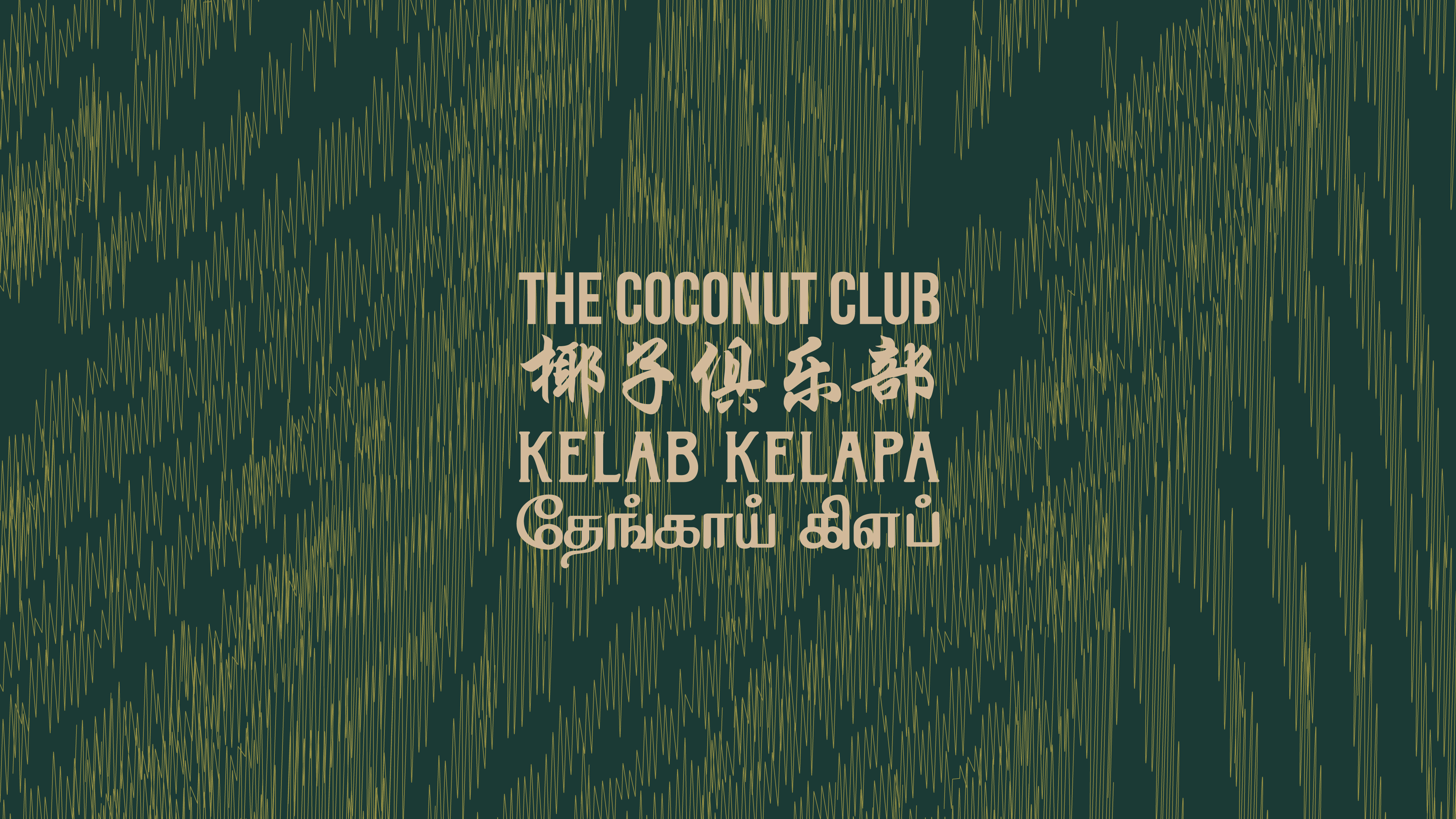


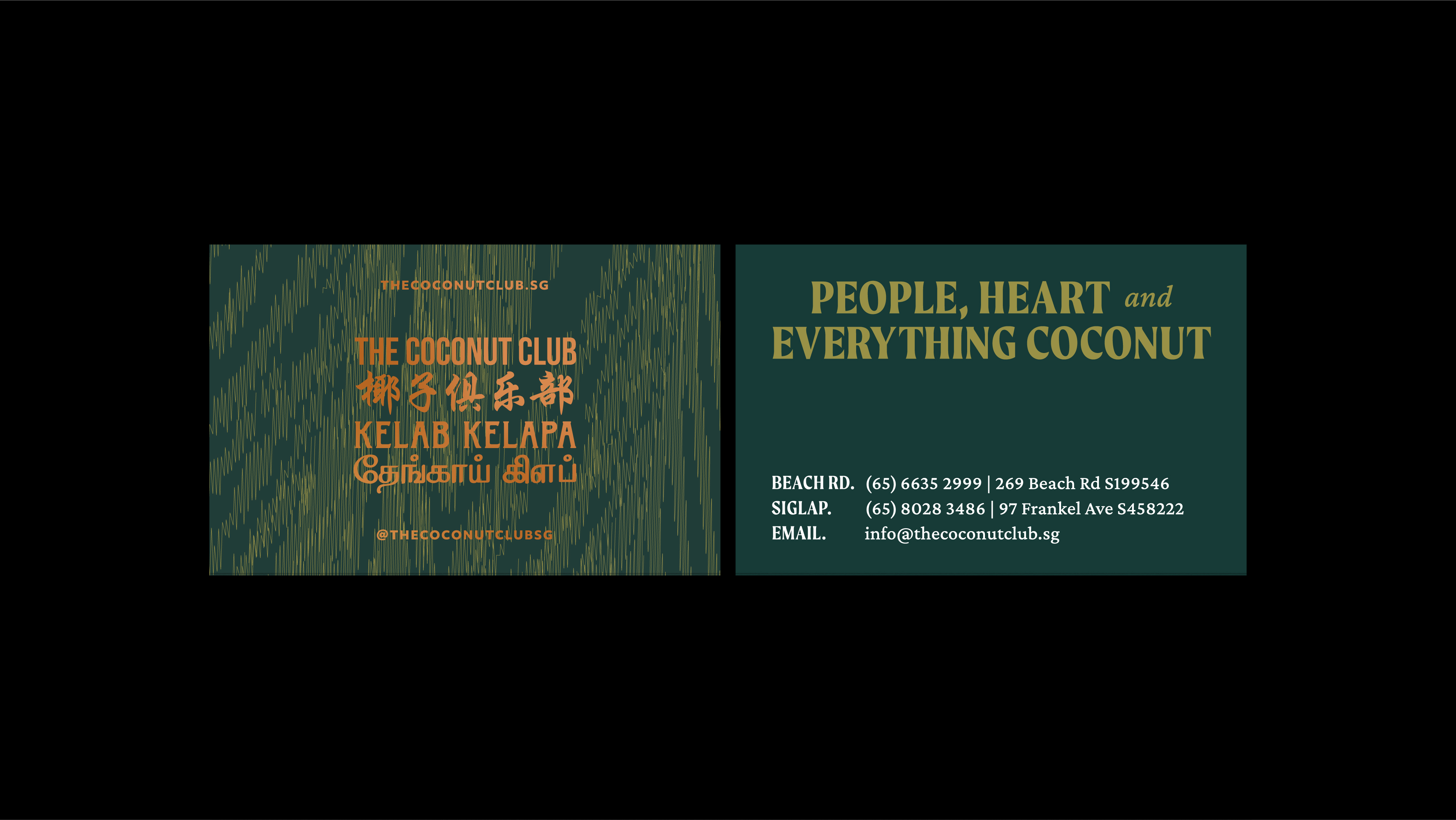
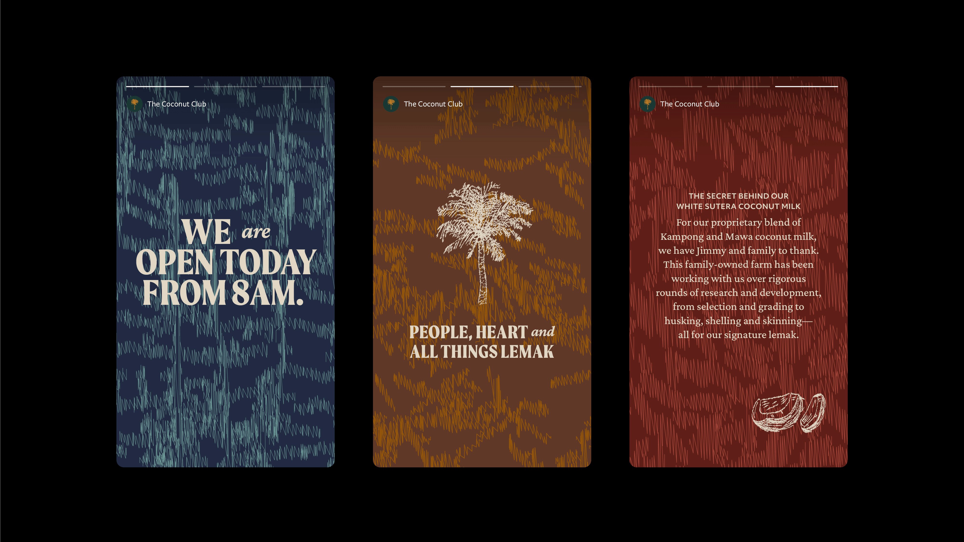
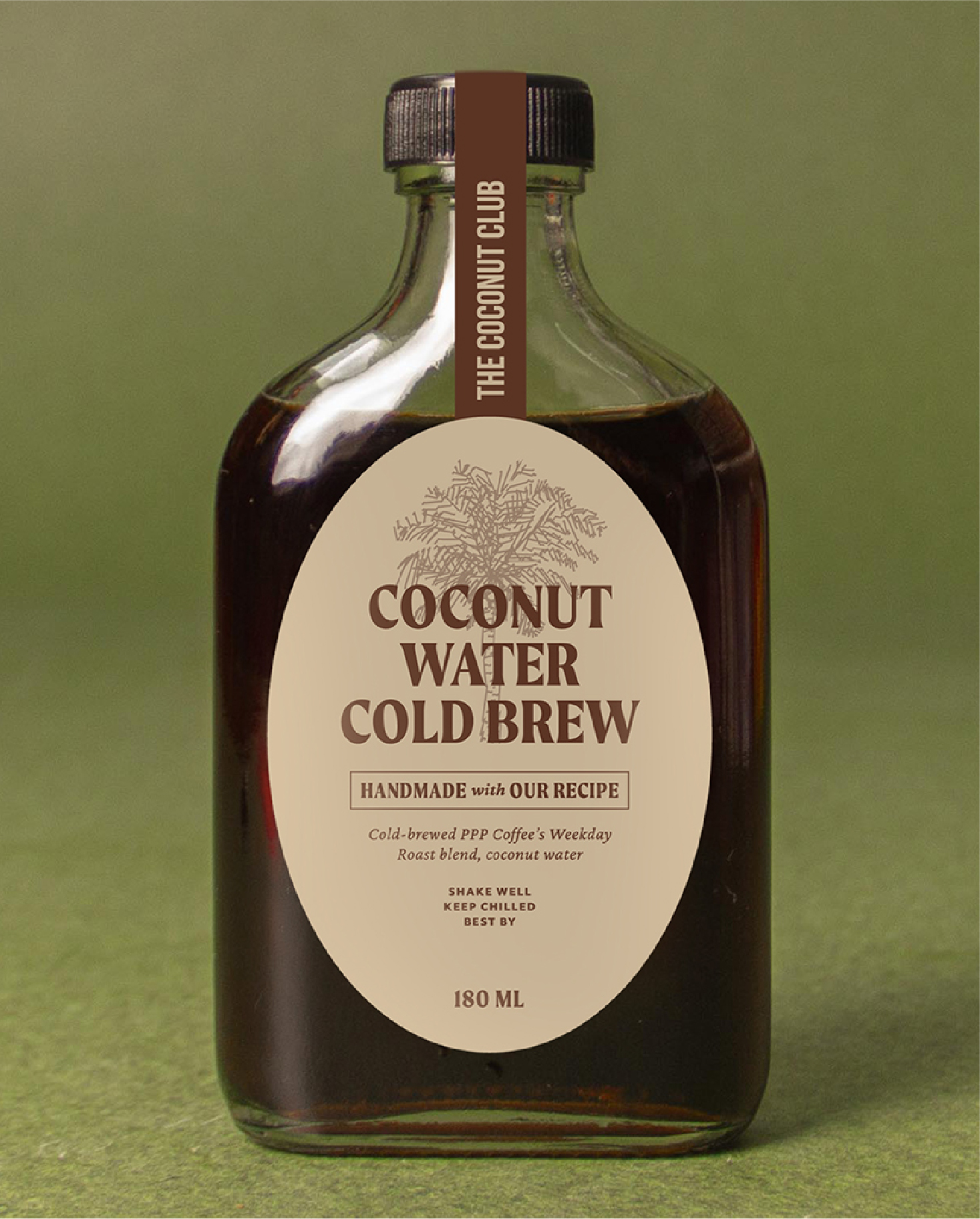
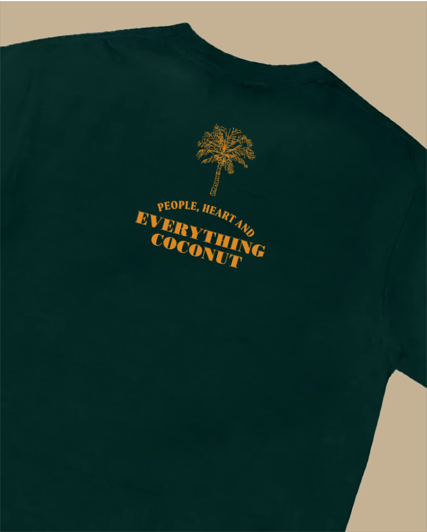
To build a diversified brand world with a lot of layers to play with—i’ve developed a set of textures inspired by coconuts (husk, fibers, tree barks) and recreated the coconut tree logomark. The scribbling effect is referenced from Ikat, a print technique commonly found in Southeast Asia. Ikat means ‘to bind’ in Indonesia, which sits perfect with the kampong spirit in The Coconut Club. These scribbling texture runs from textures to illustration—a unique and recognisable graphic set that The Coconut Club can own.
Colour plays an important role in the brand universe as they communicate the different depths of richness in the cuisine, the people and their stories. The color palette is inspired by culture and key components that makes up the Great Southeast and the food they eat.
Colour plays an important role in the brand universe as they communicate the different depths of richness in the cuisine, the people and their stories. The color palette is inspired by culture and key components that makes up the Great Southeast and the food they eat.